How to Design An Effective Postcard for Your Small Business
Mark Hale ‐ July 29, 2019

Postcard marketing is easy and effective for most small businesses. How do you design an effective postcard? Should you use one of those postcard templates you found online?
You want to design an effective postcard that is aesthetic and looks good. The problem is that “aesthetic” and “looking good” may not create a response and drive the traffic you want from your postcard mailer.
You are not designing a home decorating project that Joanna Gaines would be proud of. YOU ARE TRYING TO GET THE ATTENTION OF AND DEVELOP INTEREST IN an offer you hope a prospect will respond to.
First Things First, Things To Consider Before You Get Started
Before you begin designing an effective postcard consider the end-user, AKA the recipient of the postcard. What is happening with your average prospect today?
- They are very busy.
- They are very rushed.
- They consume media and advertising very lazily with their attention being sporadic and bouncing from one thing to another.
- Consumers are bombarded with over 1800 advertising messages a day. Some ignore most of what they see and hear.

The Following Are 10 Design Tips That Get Your Postcard Design Noticed:
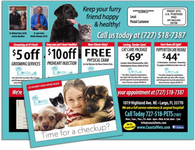
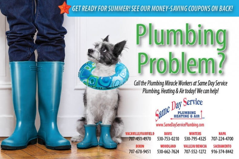
- Clear and bold headline. The headline should contain the main benefit of the product or offer.
- Relevant photos and graphics.
- Use bright colors in the design. Remember the first step to any successful ad campaign is getting noticed. Pastel colors do not get noticed unless they are used to contrast brighter colors.
- You must include a special offer on your postcard. Give the prospect a reason to respond. The offer has to be of real value to the prospect.
- Reinforce the main headline on the front of the postcard with subheadline on the back that ties in and is relevant.
- Always include benefits to every feature mentioned. People buy benefits.
- Do not forget your company name, logo, website and most importantly your phone number. The phone number should be in at least two places on the postcard.
- Design-wise, your call-to-action has to almost clash with the rest of the card. It needs to be loud, bright and very noticeable. Make sure your call-to-action contains a benefit for responding now. By definition, a call-to-action is an action phrase, for example, “Call now and receive (blank) for $$$!
- Always have an expiration date on your offer. If it looks like they can buy your product or service anytime, why buy now?
- If you have reviews and testimonials include them. Third-party validation goes a long way today.






Your Website – Is It Ready To Handle Leads?
Today 90% of people who have an interest in your postcard offer will go online and check out your website and reviews. Make sure your website looks good and is designed to convert people from shoppers to buyers. I have seen many marketers lose 80% of their potential results with an outdated, poorly designed website.
Do not get cheap and hire your brother-in-law to design your website. Invest a little money and do it right. Your returns and leads from your website will pay off with a good design
Getting noticed is the first step in any ad campaign. Postcard marketing puts a message directly in your best prospects hands. Do not waste this opportunity to get noticed. If your design is poor with too much information on the card and does not grab attention your mailer goes in the trash without even so much as a yawn.
Need help designing an effective postcard mailer and campaign for your small business? Fill out the form below and one of our Marketing Consultants will contact you shortly.
High Quality
Printing And Design
Our Services
- Postcard Printing
- Business Brochures
- Booklet Printing
- Flyers
- Signs and Banners
- Customer Thank You Cards
- Websites
- Custom Pocket Folders
Join 1,000s of
happy customers


