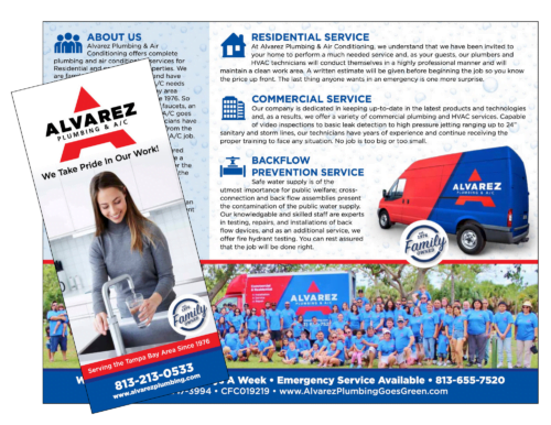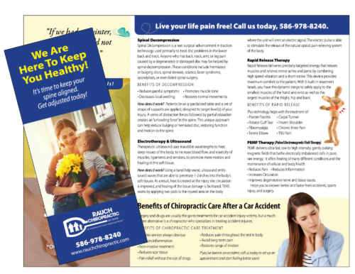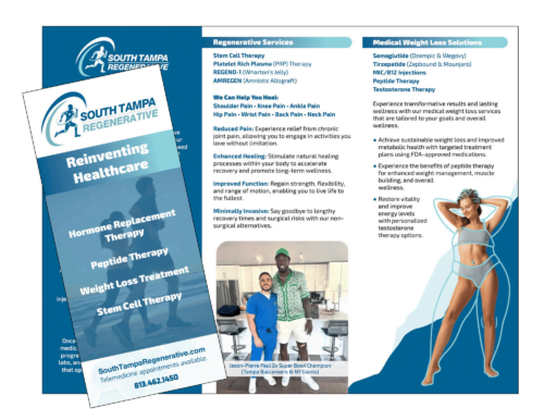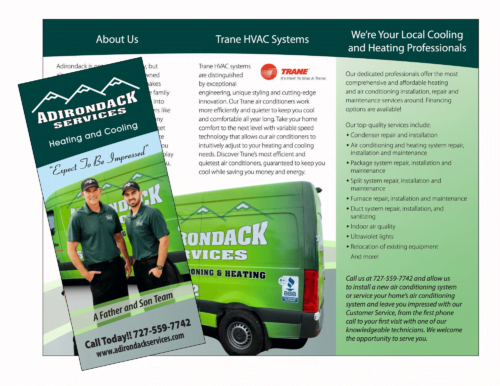
Fatal Mistakes in Brochure Design: How to Avoid Them (and Save Your Marketing A**)
Mark Hale ‐ January 15, 2025
Brochure design can be tricky. It’s like hosting a dinner party—you need the right balance of substance, style, and something that makes people go, “Wow!” But make a misstep, and your guests (or prospects) will quietly toss your masterpiece into the trash can.
Yes, there are common mistakes. Yes, I’m going to share them with you, but I’m going to sprinkle them with a little humor and some tips to keep your marketing efforts from crashing like a bad soufflé.
Mistake 1: Forgetting Your Audience
Designing a brochure without considering your audience is like trying to sell snow shovels in Miami. Sure, it might work once in a freak snowstorm but don’t count on it.
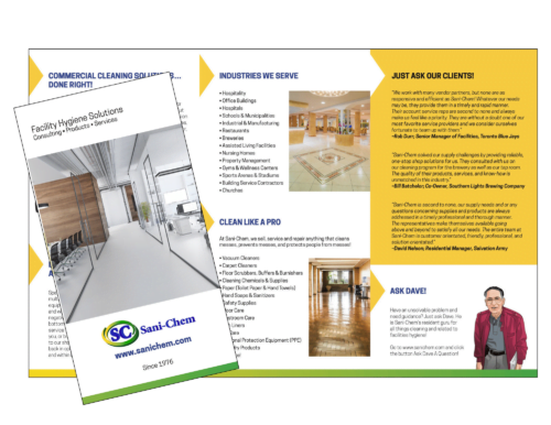
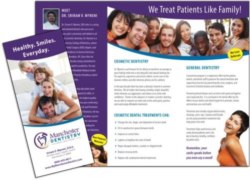
- Fix it: Think like your target audience. If you’re marketing to tech enthusiasts, don’t use Comic Sans and stock photos from the ‘90s. If your audience is parents, ditch the jargon and show how you’ll make their lives easier. Why do they buy your product?
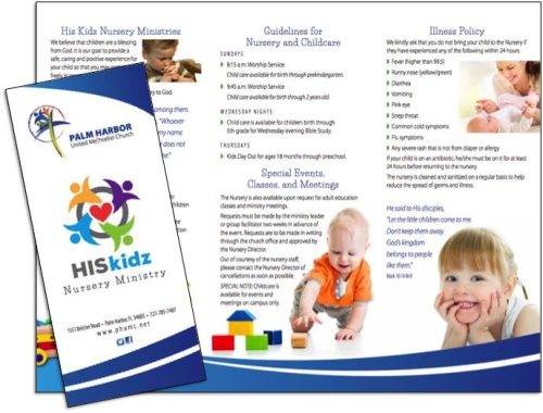
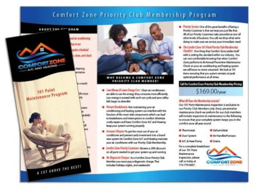
Example: A daycare’s brochure with pictures of happy kids playing in colorful rooms? Perfect. A brochure with dense text about childhood brain development? Misses the boat.
Mistake 2: TMI (Too Much Information)
Nobody wants to read a brochure that feels like a dissertation. We live in a “sound bite” world. Brevity rules the day. Too much text is like putting 10 pounds of potatoes into a 2-pound sack—it just doesn’t work.
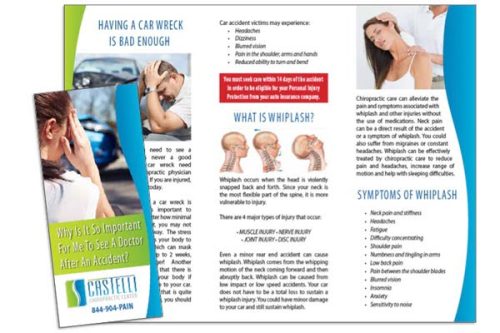
- Fix it: Stick to the essentials. Use bullet points, headlines, and short paragraphs. Remember, your brochure isn’t a novel; it’s more like the back cover—just enough to hook them and create interest.
Funny Tip: If your mom can’t skim it in under a minute while sipping coffee, you’ve overdone it.
Mistake 3: No Visual Hierarchy
Imagine walking into a room where everyone is shouting at you at once. That’s what a brochure without a clear layout feels like. There is no eye trail. One point should pull your eye in and guide you through the brochure.
- Fix it: Use big, bold headlines for the important stuff. Break up sections with subheadings, and let your content breathe with some whitespace. White space is your friend it allows your message to pop.
Pro Tip: Think of your brochure like a first date. Start with the “wow” (headline), follow with charm (images), and leave them with a reason to call, (CTA).
Mistake 4: Low-Quality Images
Nothing screams “amateur hour” like blurry photos or awkward clip art. Your brochure deserves better.
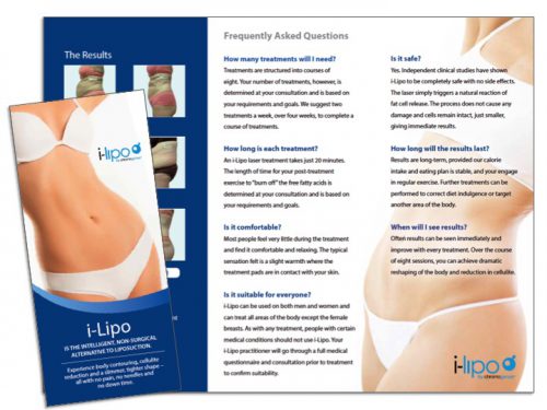
- Fix it: Use professional photography or high-quality graphics. If your budget is tight, there are affordable stock image sites. Just don’t pick the photo of the smiling business team that everyone has seen a million times.
Funny Example: Your restaurant’s “fresh seafood” brochure won’t sell much if the shrimp look like they’ve been on vacation since 1998.
Mistake 5: Weak Call-to-Action (CTA)
Without a strong CTA, your brochure is like a GPS with no destination. Sure, it’s fun to look at, but where are you going?
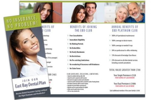
- Fix it: Be clear and direct. “Call us today for 20% off” or “Visit our website to book your consultation” works way better than “We’re here if you feel like it, maybe.”
Funny Tip: Think of your CTA as your brochure’s mic drop. Make it bold, make it memorable, and then walk off the stage.
A great brochure is like a first impression—you only get one chance. Avoid these mistakes, and your marketing piece will go from “meh” to memorable. Remember, it’s not just about looking good (though that helps). Your brochure needs to inform, persuade, and make people act. Nail it, and you’ll have prospects calling, visiting, and buying faster than you can say, “Who needs a brochure anyway?” Spoiler alert: You do.
High Quality
Printing And Design
Our Services
- Postcard Printing
- Business Brochures
- Booklet Printing
- Flyers
- Signs and Banners
- Customer Thank You Cards
- Websites
- Custom Pocket Folders
Join 1,000s of
happy customers


