The Secret of Good Carbonless NCR Forms
Mark Hale ‐ February 3, 2014
There are those who are bored to tears by the thought of designing a form and those who love the fussy challenge of creating a good, clear, usable document.
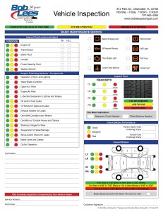
Forms are seriously underrated in the world of graphic design. The purpose of the form is to gather data in an organized fashion. There is more to designing a form than breaking out your excel spread sheet. A poorly designed form causes confusion and over work, therefore the form will not be used.
If you are looking for a NCR form that is functional and looks great, there are only four areas you need to address.
Of the four basic design principles (contrast, repetition, alignment and proximity), the secret to a good-looking form is alignment. Lack of alignment is the single biggest failure that makes a form appear unclear to the user.
Need Pricing on Your Carbonless Forms?
1. Contrast. The other principles are also very important, as in any design, particularly contrast, to help direct the user through the form. The use of shading and half tone can help guide the eye to key points.
2. Proximity. Proximity is used to keep groups of related pieces of information together. It is also used to keep unrelated elements further apart. The form should flow from one step to the next logical step.
3. Alignment. Alignment is also key. The top example uses interesting typefaces and calls out the major features in bold for clarity in communication and visual contrast but it doesn’t look as clean and clear as it could. In the lower example, elements are aligned, which naturally presents a cleaner look.
Cleaner communicates better. Also, the spacing should be adjusted so that the elements that belong together are closer together, and the separate elements have a wee bit of extra space between them (following the principle of proximity).
4. Repetition. The fourth thing for a good looking and useable NCR form is the type style you select. Some fonts are easier to read than others. Especially if there is a lot of writing on the form, the wrong font can make your form look like too much reading. You want the font to make the form appear easy to read and use.
Click Here to See Carbonless Form Samples
Oddly enough, you will find the better your forms look, the more they will be used. Once you have your form designed, you have to decide how many copies you need. The most common forms are two or three part NCR or carbonless with white, yellow and pink copies. These color codes make for ease of routing your data.
Our graphic artists can design a form that is functional and also helps build your brand. Call us or click here to get the process moving.
©2005-2014 Mark Hale, All Rights Reserved
High Quality
Printing And Design
Our Services
- Postcard Printing
- Business Brochures
- Booklet Printing
- Flyers
- Signs and Banners
- Customer Thank You Cards
- Websites
- Custom Pocket Folders
Join 1,000s of
happy customers


