

Trapped Over Graphic Design
Mark Hale ‐ December 27, 2013
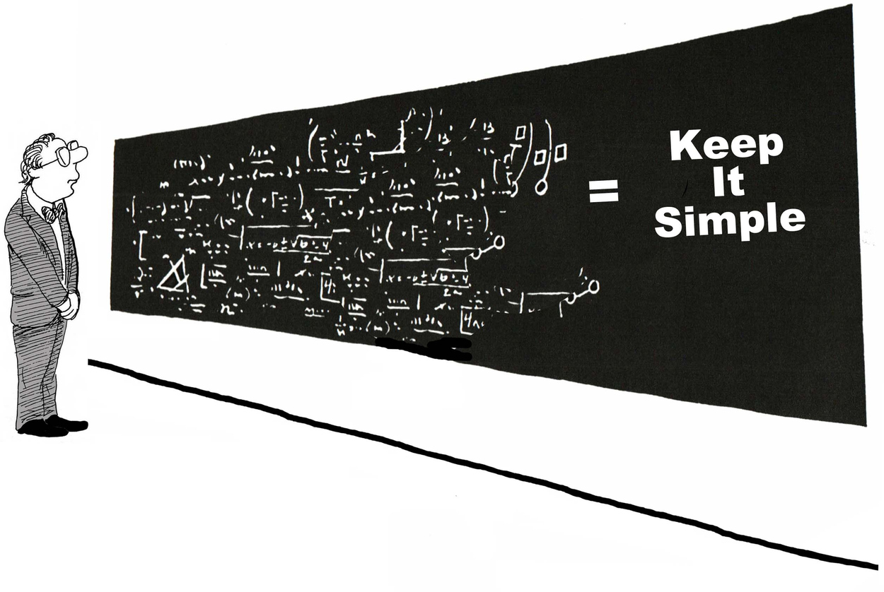
 Simplicity is often seen, but it’s a concept that is not easily explained. For some graphic designers, it’s second nature. For others, it involves much forethought. Today’s designers are trending toward simpler, clutter-free graphic designs, as they return to simplicity.
The over-designed marketing piece usually does not get read by the end user. The purpose of marketing materials is to get attention and develop interest. A piece that is over-designed will not get read and will not generate interest.
The following are some examples of how the traditional theme of less is more can be used effectively:
Advertising, postcards and other print ads: Not only can simple ads grab attention, but their short and to-the-point messages are also easier to comprehend. The concept of “less is more” is especially effective when writing ad copy. Resist the urge to over explain. Highlight the main benefits in simple terms.
Catalogs and Brochures: Catalogs and brochures are expected to be a vast source of information, yet readers appreciate when they are simplified, organized and easy to read and comprehend. Simplicity is often its own reward since it encourages increased use. Full four-color process printing offers an affordable means to get noticed and drive sales to your door.
Pocket Presentation Folders: A simple graphic design that communicates clearly can also save you money on printing costs. Often you can use shadowing and half tones to make your pocket folder a one of a kind marketing piece that will help drive sales.
NCR Business Forms: Business forms have to serve two masters. They have to be easy to use and gather the data you need and also be aesthetically designed so that they tie in with your other materials and help to build your companies brand.
Packaging: Like a poster, a package needs to attract the eye within seconds of its initial viewing. In recent years, shelves have been jammed with products whose designers have attempted to out-design one another. This gives simple package designs featuring primary colors, bold copy, white space and clean design the ability to effectively break through the clutter.
Corporate Identity: The most basic of your company identity is your logo. Not only do logos convey the personality of a company, but they also offer a memorable impression. Simple designs that incorporate a company’s complex ideas are the root of a logo’s power.
The idea is that all of your printed and electronic medias tie together and have a common personality or character for a company or product. Simplicity does mean a return to basics, but not at the expense of creative design. There is a balance between simplicity, aesthetics and creativity.
Mark Hale
CEO


High Quality
Printing And Design
Our Services
- Postcard Printing
- Business Brochures
- Booklet Printing
- Flyers
- Signs and Banners
- Customer Thank You Cards
- Websites
- Custom Pocket Folders
Join 1,000s of
happy customers